



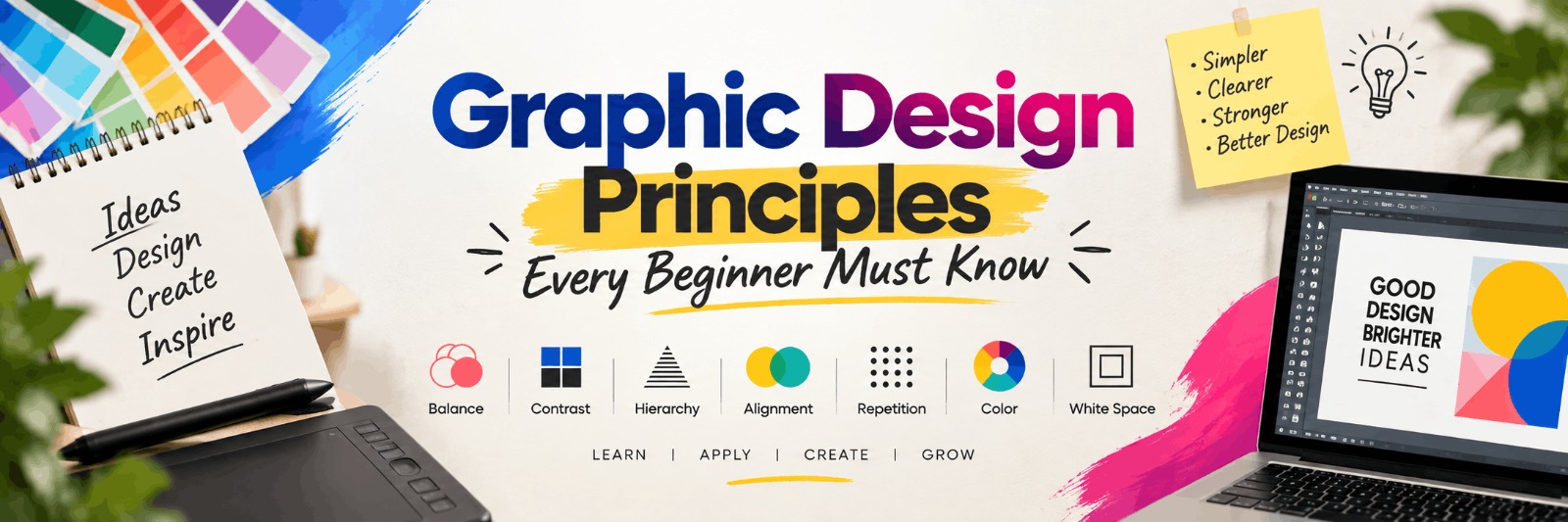
Graphic Design Principles Every Beginner Must Know
Every strong design, whether it's a logo, a social media post, or a website banner, follows a set of rules that make it visually pleasing and easy to understand. These rules don't change much with time, but the tools we use to apply them do. As design software gets smarter and trends shift with each passing year, beginners often get distracted by fancy effects and forget the basics. This article breaks down the core graphic design principles every beginner should master, explains why they matter, and shows how to practice them with real tools and exercises. By the end, you'll have a clear roadmap to build a strong design foundation.
Why Design Principles Matter More Than Trends
Trends come and go, but principles like balance, contrast, and alignment remain the backbone of good design. A beginner who understands these fundamentals can adapt to any software update or style change. Someone who only copies trending templates without understanding the "why" behind them will struggle the moment those templates go out of fashion.
Think of it like learning grammar before writing stories. You can technically write without knowing grammar rules, but your work will lack clarity and polish. The same applies to design.
1. Balance: Creating Visual Stability
Balance refers to how visual weight is distributed across a design. If one side feels heavier than the other, the composition looks off, even if the viewer can't explain why.
- Symmetrical balance: Elements are mirrored on both sides, giving a formal, stable feel. Common in wedding cards or corporate certificates.
- Asymmetrical balance: Different elements of varying size and colour balance each other out, creating a more dynamic, modern look. Common in startup branding and app interfaces.
- Radial balance: Elements radiate from a central point, often seen in logos and badge designs.
Common mistake: Beginners often place all text and images on one side of a poster, leaving the other side empty. A simple fix is to imagine a weighing scale and distribute elements accordingly.
2. Contrast: Making Elements Stand Out
Contrast helps important elements catch the eye first. It can be created through colour, size, shape, or font weight.
For example, a call-to-action button on a landing page should contrast with the background so users notice it immediately. Similarly, headings should look distinctly different from body text through size or weight.
Practical Tip
Try the "squint test" - squint your eyes while looking at your design. If you can still tell what's most important, your contrast is working well.
3. Typography: Choosing and Pairing Fonts
Typography is often underestimated by beginners, yet it can make or break a design. Good typography improves readability and sets the tone of the entire piece.
- Avoid mixing more than two or three font families in one design.
- Pair a decorative or bold display font with a clean, simple body font.
- Maintain consistent line spacing (leading) for readability, especially in long text blocks.
- Check how your chosen font looks on both mobile and desktop screens before finalising.
Common mistake: Using too many decorative fonts in a single poster, which confuses the reader and looks unprofessional. Stick to a clear hierarchy - one font for headings, one for body text.
4. Colour Theory: Setting the Right Mood
Colour choices influence how people feel about a brand or design before they even read a word. Understanding basic colour theory helps beginners avoid clashing or overwhelming palettes.
- Complementary colours (opposite on the colour wheel) create strong contrast and energy.
- Analogous colours (next to each other) create a calm, harmonious feel.
- Monochromatic schemes use different shades of one colour for a clean, minimal look.
Expert tip: Limit your palette to 2-4 colours per project. Tools like Adobe Color or Coolors can help beginners generate balanced palettes quickly.
5. Alignment and Grids: Bringing Order to Chaos
Alignment keeps designs looking neat and intentional. Randomly placed text or images, even if individually well-designed, can make a layout feel messy.
Using a grid system, something built into most design software like Adobe Illustrator, Figma, and Canva, helps beginners align elements consistently. Magazine layouts, business cards, and websites almost always rely on invisible grids to organise content.
6. Proximity: Grouping Related Elements
Proximity is about placing related items close together and separating unrelated ones with space. For instance, a contact number and email address should sit closer together than the number and an unrelated tagline.
This principle reduces visual clutter and helps viewers process information faster, which is especially important for resumes, brochures, and infographics.
7. White Space: The Power of Empty Areas
Beginners often feel the urge to fill every inch of a canvas. But empty space, also called negative space, gives designs room to breathe and directs attention to what matters most.
Apple's product pages and minimal logo designs are strong examples of how white space can make a design feel premium rather than incomplete.
8. Hierarchy: Guiding the Viewer's Eye
Visual hierarchy determines what viewers notice first, second, and last. It's usually achieved by combining size, colour, and placement.
For example, on a poster, the event title should be the largest element, followed by the date and venue, with fine print details appearing smallest at the bottom.
Tools Beginners Should Practice With
Understanding principles is only half the journey; applying them with the right tools matters equally. Some commonly used software includes:
- Adobe Photoshop - for photo editing and raster-based designs
- Adobe Illustrator - for vector graphics, logos, and icons
- Figma - for UI/UX and collaborative design work
- Canva - for quick social media and marketing designs
Beginners don't need to master all four at once. Start with one tool, understand the principles through it, and expand gradually.
Building a Beginner Portfolio
Once you're comfortable applying these principles, start creating sample projects even before landing your first client or job:
- Redesign an existing poster or ad you find poorly designed
- Create three logo concepts for a fictional brand
- Design a simple Instagram carousel following alignment and hierarchy rules
- Recreate a magazine page layout using grids
Keep these projects organised in a digital portfolio using platforms like Behance so you can track your improvement and show your work to potential employers or clients.
Learning Path for 2026 and Beyond
A practical way to build these skills is to move step by step: start with design theory and sketching, move to one core software tool, practice with real briefs, then gradually explore specialisations like branding, UI/UX, or motion graphics. Self-learning through YouTube and free resources works for some, but many beginners find structured feedback speeds up their progress significantly.
If you want structured classroom training and guided learning, GDI's Graphic Design course may be worth considering, especially if you prefer hands-on practice with mentor feedback rather than learning everything alone through scattered online videos.
Common Mistakes Beginners Should Avoid
- Overusing effects like shadows, gradients, and 3D text without purpose
- Ignoring feedback because it feels personal rather than professional
- Copying trending designs without understanding the principles behind them
- Not testing designs across different screen sizes or print formats
- Skipping the basics to jump straight into advanced software features
Freelance and Job Opportunities
Once these fundamentals are solid, beginners can explore opportunities such as freelance social media design, working with small local businesses on branding, joining a design agency as a junior designer, or contributing to in-house marketing teams. Our team can share more specific details on career paths and course structure if you're exploring this as a serious career option.
Conclusion
Mastering graphic design principles isn't about memorising rules, it's about training your eye to notice what works and what doesn't. Balance, contrast, typography, colour theory, alignment, proximity, white space, and hierarchy form the foundation that every successful designer builds upon, regardless of which software or trend dominates 2026. Practice these fundamentals consistently, seek feedback, and your design instincts will sharpen naturally over time.
About Graphic Design Institute
Graphic Design Institute (GDI) is a training institute based in Rohini, Delhi, offering practical courses in Graphic Design, Video Editing, Web Design, Web Development, Digital Marketing, AutoCAD 2D & 3D, and Data Analytics. GDI focuses on hands-on, project-based learning to help students build real-world skills and a portfolio they can confidently show employers or clients.
If you're based in or around Rohini, Delhi and want guided, classroom-based training to strengthen your design fundamentals, feel free to reach out to GDI's team to learn more about the course structure.
Interested in learning more? Explore our Graphic Design course or register now for a free demo class at Graphic Design Institute.
Frequently Asked Questions
Everything you need to know before joining.