


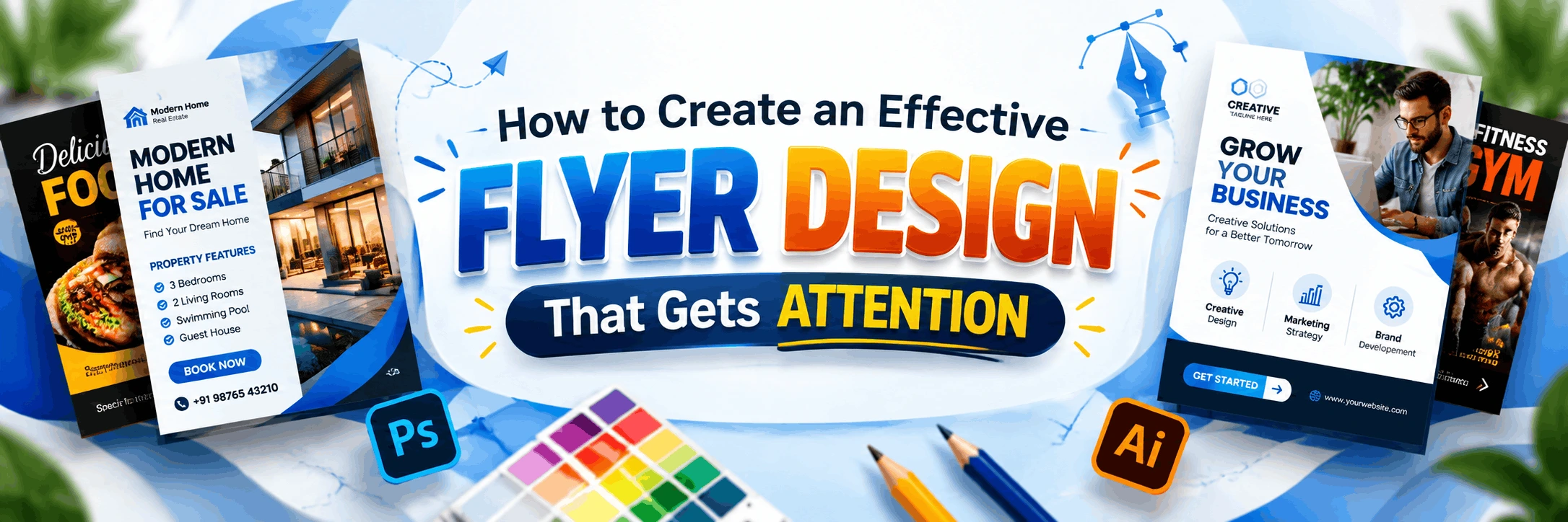
How to Create an Effective Flyer Design That Gets Attention
A flyer has barely two or three seconds to convince someone it's worth a second look. Whether it's for a college fest, a local sale, a gym launch, or a community event, the design either stops people in their tracks or gets tossed aside without a glance. This article breaks down what actually makes a flyer design effective - from layout and colour choices to typography and common mistakes beginners make. By the end, you'll have a practical checklist you can apply to your next flyer project, whether you're a student, a small business owner, or someone exploring graphic design as a career.
Why Most Flyers Fail to Grab Attention
Before learning what works, it helps to understand what doesn't. Most flyers fail not because the designer lacks creativity, but because they try to say too much at once. A flyer crammed with text, too many fonts, and clashing colours confuses the viewer instead of guiding them. People skim flyers the way they skim social media posts - quickly and emotionally. If the message isn't clear within seconds, the flyer has already failed its purpose.
Start With One Clear Message
Every effective flyer design begins with a single, focused idea. Ask yourself: what is the one thing I want the viewer to remember or do after seeing this flyer? It could be "Attend this workshop," "Get 30% off this weekend," or "Visit our new store."
Once that message is clear, everything else in the design - headline, image, colours - should support it. Avoid listing every detail about your event or offer. Save the finer points for a website link, QR code, or contact number at the bottom.
Example of Message Hierarchy
- Headline: The main hook (largest text, grabs attention first)
- Subheading: Supporting detail (date, offer percentage, or benefit)
- Body text: Minimal details (venue, timing, terms)
- Call to action: What to do next (call, visit, scan, register)
Layout Principles That Make a Flyer Work
Good layout is what separates a professional-looking flyer from an amateur one. A few principles to keep in mind:
- Visual hierarchy: Guide the eye from the most important element to the least important using size, placement, and colour contrast.
- White space: Don't fill every inch of the flyer. Empty space helps important elements stand out and makes the design feel less cluttered.
- Alignment: Keep text and images aligned to an invisible grid. Random placement makes a design look unplanned.
- Balance: Distribute visual weight evenly so the flyer doesn't feel lopsided, even if it's not perfectly symmetrical.
Choosing Colours That Grab Attention (Without Overdoing It)
Colour is one of the fastest ways a flyer communicates mood and urgency. Bright, warm colours like red, orange, and yellow tend to grab attention quickly, which is why they're common in sale and event flyers. Cooler tones like blue and green feel calmer and work well for wellness, education, or corporate flyers.
A simple rule for beginners: pick one dominant colour, one accent colour, and one neutral (black, white, or grey) for text and backgrounds. Using too many colours at once is one of the most common reasons flyers look unprofessional.
Common Colour Mistakes to Avoid
- Using low-contrast text and background combinations (like yellow text on a white background)
- Picking colours that don't match the brand or event tone
- Overusing gradients or neon shades that strain the eyes
Typography: Readable First, Stylish Second
Flyers are often viewed quickly, sometimes from a distance - on a notice board, a shop window, or a WhatsApp forward on a small phone screen. This makes readability more important than decorative fonts.
- Limit yourself to two or three fonts maximum - one for headlines, one for body text.
- Avoid script or handwritten fonts for large blocks of text; they're hard to read quickly.
- Make sure font size is large enough to read from a short distance, especially for print flyers.
- Use bold or colour contrast to highlight key details like dates, prices, or phone numbers.
Images and Graphics That Add Value
A strong visual can communicate faster than text. But not every image helps - a flyer with a blurry, stretched, or irrelevant photo looks worse than one with no image at all. Keep these points in mind:
- Use high-resolution images, especially for print flyers, to avoid pixelation.
- Choose images that are relevant to the message, not just decorative stock photos.
- If using icons or illustrations, keep the style consistent throughout the design.
- Leave enough space around images so they don't compete with text for attention.
Print Flyer vs Digital Flyer: What Changes?
A flyer meant for printing and one meant for Instagram or WhatsApp need slightly different design approaches, even if the core message stays the same.
| Factor | Print Flyer | Digital Flyer |
|---|---|---|
| Resolution | High-resolution (300 DPI) for sharp printing | Lower resolution acceptable (72-150 DPI) for screens |
| Colour Mode | CMYK for accurate print colours | RGB for vibrant screen display |
| File Format | PDF or high-quality JPEG for the printer | PNG or JPEG optimised for fast loading |
| Text Size | Larger, since it may be viewed from a distance | Can be slightly smaller, viewed up close on screens |
| Call to Action | Phone number, address, or walk-in details | Clickable links, QR codes, swipe-up actions |
Tools Used for Flyer Design
Several tools are commonly used by designers to create flyers, ranging from beginner-friendly to professional-grade:
- Adobe Photoshop: Great for photo-based flyers with detailed editing
- Adobe Illustrator: Ideal for vector-based, scalable flyer designs
- Canva: Beginner-friendly with ready templates, good for quick projects
- CorelDRAW: Widely used for print-ready flyer and poster design
Learning these tools properly, along with design theory like colour, layout, and typography, makes a real difference in the quality of output. If you want structured classroom training and guided learning, GDI's Graphic Design course may be worth considering, especially if you're starting from scratch and want hands-on practice with real design briefs.
Common Mistakes Beginners Make With Flyer Design
- Trying to include too much information instead of focusing on one message
- Ignoring the target audience's preferences (a college fest flyer shouldn't look like a corporate seminar flyer)
- Using low-quality or copyrighted images without permission
- Skipping proofreading - spelling errors on a flyer can hurt credibility
- Not testing how the flyer looks when printed or viewed on a small phone screen
A Simple Checklist Before Finalising Your Flyer
- Is the main message clear within three seconds of viewing?
- Is the hierarchy guiding the eye from headline to call-to-action?
- Are colours and fonts limited and consistent?
- Is all text proofread and accurate?
- Is the file saved in the correct format and resolution for its purpose (print or digital)?
Conclusion
Creating an effective flyer design isn't about using fancy effects or expensive software - it's about communicating one clear message in a visually organised way. Focus on hierarchy, keep colours and fonts limited, choose relevant images, and always design with your specific audience in mind. With consistent practice and a good understanding of design fundamentals, anyone can learn to create flyers that actually get noticed and drive action.
About Graphic Design Institute
Graphic Design Institute (GDI) is a training institute based in Rohini, Delhi, offering practical, project-based courses in Graphic Design, Video Editing, Web Design, Web Development, Digital Marketing, AutoCAD 2D & 3D, and Data Analytics. The institute focuses on hands-on learning with industry-relevant tools to help students build real, portfolio-ready work.
If you're looking to learn flyer design and other graphic design skills in a structured, guided environment, our team at GDI can share exact course details, schedules, and learning paths suited to your goals.
Interested in learning more? Explore our Graphic Design course or register now for a free demo class at Graphic Design Institute.
Frequently Asked Questions
Everything you need to know before joining.