



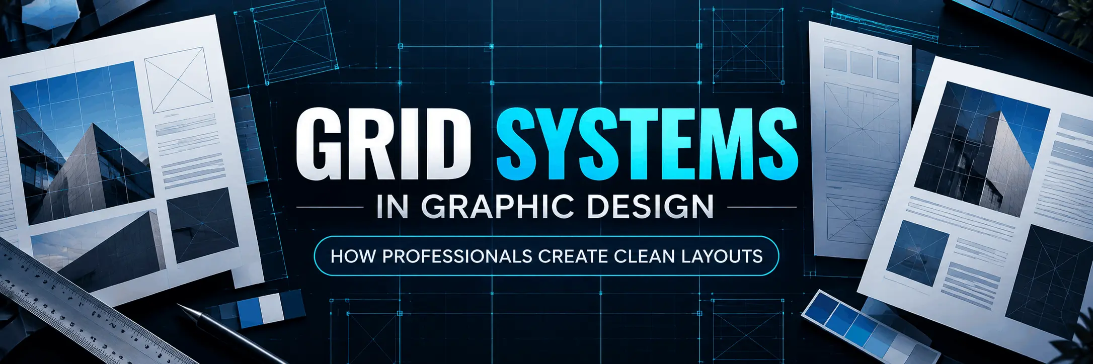
Grid Systems in Graphic Design: Clean Layouts Explained
Walk into any well-designed magazine, website, or poster, and you'll notice something you might not consciously register: everything lines up. Text blocks, images, headings, and white space all follow an invisible structure. That structure is called a grid system, and it's one of the most important tools professional designers use to bring order to their work. This article explains what grid systems in graphic design actually are, the common types used in the industry, how to apply them step by step, and the mistakes beginners usually make when working with grids.
What Is a Grid System in Graphic Design?
A grid system is a set of intersecting horizontal and vertical lines used to structure content on a page. Think of it as an invisible skeleton that guides where text, images, and other elements should sit. The grid itself is never visible in the final design, but its effect is visible in how organised and balanced the layout feels.
Grids are built using a few basic components:
- Columns - vertical divisions that hold text and images
- Rows - horizontal divisions that help align elements across the page
- Margins - the space between content and the edge of the page
- Gutters - the space between columns or rows
- Modules - smaller units formed when rows and columns intersect
Once these elements are defined, a designer can place content consistently across multiple pages or screens, which is especially useful for brochures, websites, annual reports, and social media templates.
Why Professional Designers Rely on Grids
Grids aren't just about making things look neat. They solve real design problems.
- Consistency: A grid ensures that similar elements look and behave the same way across different pages or screens.
- Faster decision-making: Instead of guessing where to place an image or heading, the grid gives you pre-defined zones to work with.
- Visual hierarchy: Grids make it easier to guide the viewer's eye from the most important element to the least important one.
- Responsive adaptability: In web and app design, grids allow layouts to adjust smoothly across different screen sizes.
- Team collaboration: When multiple designers work on the same brand or project, a shared grid keeps everyone's output aligned.
Common Types of Grid Systems
Column Grid
This is the most widely used grid in print and web design. The page is divided into vertical columns, and content is placed within one or more columns. News websites, blogs, and brochures often use a 2, 3, or 12-column structure.
Modular Grid
A modular grid adds horizontal rows to a column grid, creating a matrix of small boxes called modules. This is ideal for layouts with lots of repeating content, such as product catalogues, portfolios, or dashboard-style pages.
Manuscript Grid
Also called a single-column grid, this is the simplest form, mostly used for text-heavy content like books, essays, or long-form articles where a single block of text runs down the page.
Baseline Grid
This grid uses horizontal lines spaced at equal intervals to align text baselines across columns. It's particularly useful for maintaining consistent line spacing in multi-column layouts.
Hierarchical Grid
Unlike rigid structured grids, a hierarchical grid is organised based on the content's natural flow and importance rather than equal divisions. It's commonly seen in organic, content-driven website layouts.
| Grid Type | Best Used For | Flexibility |
|---|---|---|
| Column Grid | Websites, brochures, magazines | Medium to High |
| Modular Grid | Catalogues, portfolios, dashboards | High |
| Manuscript Grid | Books, long-form text content | Low |
| Baseline Grid | Typography-heavy layouts | Medium |
| Hierarchical Grid | Organic websites, editorial design | Medium |
How to Apply a Grid System: A Step-by-Step Approach
- Define your canvas size. Know whether you're designing for A4 print, an Instagram post, or a website viewport, since grid proportions depend on final output size.
- Decide on columns and margins. Start simple - a 12-column grid works well for most web projects, while a 2 or 3-column grid suits print brochures.
- Set your gutters. Keep spacing consistent so elements don't feel cramped or scattered.
- Establish a baseline grid for text. This keeps your typography aligned and readable across the layout.
- Place key elements first. Position your logo, main heading, and hero image before adding secondary content.
- Test alignment. Zoom out and check whether elements visually line up with the grid, not just technically snap to it.
Most design software, including Adobe InDesign, Illustrator, Photoshop, and Figma, has built-in grid and guide tools that make this process faster once you understand the underlying logic.
Common Mistakes Designers Make With Grids
- Over-relying on the grid: Following it so strictly that every layout looks identical and boring.
- Ignoring white space: Filling every module with content, leaving no room for the design to breathe.
- Inconsistent gutters: Using different spacing values across pages, which breaks visual rhythm.
- Not aligning typography: Setting up a column grid but ignoring the baseline grid, leading to uneven text blocks.
- Using the wrong grid for the content: Applying a modular grid to a single long article, or a manuscript grid to a product catalogue.
A useful habit is to break the grid occasionally and intentionally - for a bold headline or feature image - rather than breaking it accidentally out of carelessness.
Grid Systems in Web and App Design
Grids become even more important in web design because layouts need to adapt to multiple screen sizes. A 12-column grid is standard practice because it divides evenly into halves, thirds, and quarters, giving designers flexibility when building responsive layouts. Frameworks like Bootstrap and CSS Grid are built around this same grid logic, which is why understanding grids in graphic design also helps when transitioning into web design or front-end development work.
Building Grid Skills: Tools and Practice
To get comfortable with grid systems, focus on these areas:
- Software: Adobe InDesign and Illustrator for print, Figma or Adobe XD for web and app layouts
- Practice exercises: Recreate layouts from magazines or websites you admire, focusing only on their grid structure
- Portfolio work: Include a few projects that clearly show your layout thinking - brochures, posters, or a simple website mockup
- Study real examples: Analyse annual reports, editorial spreads, and clean website homepages to understand how grids are used in practice
Learning grids on your own through tutorials is possible, but many students find it easier to build this skill with structured feedback from an instructor who can point out alignment issues they might not notice themselves. If you want structured classroom training and guided layout practice, GDI's Graphic Design course may be worth considering, as it covers grid systems alongside typography, colour theory, and real client-style design briefs.
About Graphic Design Institute
Graphic Design Institute (GDI) is a training institute based in Rohini, Delhi, offering courses in Graphic Design, Video Editing, Web Design, Web Development, Digital Marketing, AutoCAD 2D & 3D, and Data Analytics. The institute focuses on practical, project-based learning to help students build real design skills and a portfolio they can show to employers or clients.
If you're based in Delhi and want hands-on, classroom-guided training in layout design and other graphic design fundamentals, reach out to GDI's team to learn more about course structure and schedules.
Interested in learning more? Explore our Graphic Design course or register now for a free demo class at Graphic Design Institute.
Frequently Asked Questions
Everything you need to know before joining.