



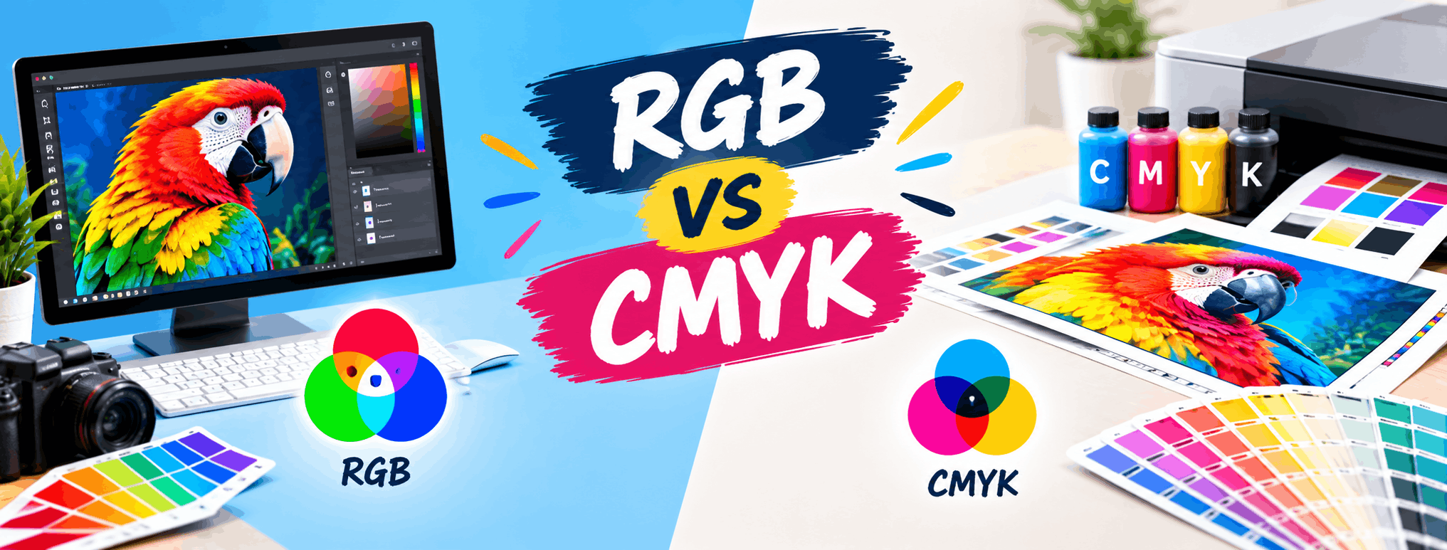
RGB vs CMYK: Key Differences Every Designer Must Know
Every designer eventually runs into a frustrating problem: colors that looked perfect on screen turn dull or muddy once printed. This usually happens because of a simple mix-up between two color modes - RGB and CMYK. Understanding RGB vs CMYK is one of the first practical lessons in graphic design, yet many beginners skip past it and pay for it later with failed print jobs. In this article, we will break down what these color modes actually mean, how they work differently, and when you should use each one. You will also find practical tips, common mistakes to avoid, and a clear comparison table to help you make the right choice for your next project.
What Is RGB?
RGB stands for Red, Green, and Blue. It is a color mode used for anything that is viewed on a screen - websites, mobile apps, social media graphics, digital ads, and video content. RGB works on the principle of light. When red, green, and blue light are combined at full intensity, they produce white light. This is called an additive color model because colors are created by adding light together.
Screens - whether it's a phone, laptop, or television - emit light through tiny red, green, and blue pixels. By adjusting the intensity of each, screens can display millions of color combinations. This is why RGB is the default mode for digital design tools when you're creating content meant to be viewed online.
What Is CMYK?
CMYK stands for Cyan, Magenta, Yellow, and Key (black). This color mode is used for anything that will be physically printed - business cards, brochures, banners, packaging, and posters. Unlike RGB, CMYK is a subtractive color model. It works by absorbing light rather than emitting it.
When ink is printed on paper, it absorbs certain wavelengths of light and reflects others back to your eyes. Combining cyan, magenta, and yellow inks in different proportions creates a range of colors, while black ink (the "K") is added to deepen shadows and improve print quality, since combining C, M, and Y alone doesn't produce a true, rich black.
Why Do RGB and CMYK Look So Different?
The core reason is simple: RGB is light-based and CMYK is ink-based. Screens can produce far more vibrant and glowing colors because light itself is brighter than ink pigments. This is why RGB has a wider color range (called a "gamut") compared to CMYK. Some bright blues, neons, and glowing greens that look stunning on screen simply cannot be reproduced accurately in print - they will always appear slightly muted or shifted when converted to CMYK.
RGB vs CMYK: A Side-by-Side Comparison
| Aspect | RGB | CMYK |
|---|---|---|
| Full Form | Red, Green, Blue | Cyan, Magenta, Yellow, Key (Black) |
| Color Model Type | Additive (light-based) | Subtractive (ink-based) |
| Used For | Screens, websites, apps, social media, video | Printed materials like flyers, packaging, posters |
| Color Range | Wider, more vibrant colors possible | Narrower range, some bright colors appear muted |
| Best File Formats | JPEG, PNG, GIF, MP4 (for web/video) | PDF, TIFF, EPS (for print-ready files) |
| Common Software Default | Photoshop (web projects), Illustrator (digital art) | Photoshop/Illustrator (set manually for print), InDesign |
When Should Designers Use RGB?
Use RGB whenever your final output will be viewed digitally. This includes:
- Website and app UI designs
- Social media graphics and ads
- YouTube thumbnails and video content
- Email newsletters and digital presentations
- Logos or graphics meant only for online use
Since screens display RGB natively, working in this mode ensures your colors appear exactly as intended across most digital devices, with only minor variations due to screen calibration.
When Should Designers Use CMYK?
Switch to CMYK whenever your design is headed for a printing press or printer. This includes:
- Business cards, letterheads, and brochures
- Packaging design and product labels
- Banners, posters, and hoardings
- Magazines, books, and newspaper ads
- Any material a print shop will physically produce
Setting your document to CMYK from the start - not converting it at the last minute - helps you catch color shifts early and adjust your palette before final approval.
A Common Mistake Designers Make
One of the most frequent errors beginners make is designing an entire print piece in RGB and converting it to CMYK only at export. This often causes an unpleasant surprise: bright blues turn purplish, vivid greens turn dull, and neon shades lose their punch. Always confirm your color mode before starting a project, not after it's finished. Most professional software like Adobe Photoshop, Illustrator, and InDesign let you set this in the document setup window itself.
Practical Tips for Working With Color Modes
- Always ask your printer or print vendor which color profile they prefer, as some request specific ICC profiles for CMYK printing.
- When designing for both web and print (like a brand identity project), create separate versions optimized for each mode rather than reusing one file.
- Use a printed color proof before mass printing large orders like packaging or banners - screen preview alone can be misleading.
- Avoid pure black (0,0,0) for large print areas in CMYK; use a "rich black" mix for deeper, more even results.
- Calibrate your monitor periodically so on-screen colors stay closer to real-world results.
Why This Matters for Design Students
Understanding color modes isn't just theory - it directly affects the quality of your portfolio and client work. A designer who submits a print-ready file in the wrong color mode can cause costly reprints and damage client trust. This is a foundational skill taught early in structured design education because it affects everything from packaging design to digital marketing creatives.
If you're a beginner trying to build strong fundamentals like this alongside practical software skills, GDI's Graphic Design course in Rohini, Delhi, covers color theory, print production, and digital design workflows through hands-on classroom practice, helping students avoid these common early mistakes.
Conclusion
The RGB vs CMYK debate isn't really about which mode is "better" - it's about using the right one for the right medium. RGB is built for screens and digital light, while CMYK is built for ink and paper. Getting this choice right from the start of a project saves time, prevents costly printing errors, and ensures your designs look exactly as intended, whether they're viewed on a phone screen or held in someone's hands as a printed brochure.
About Graphic Design Institute
Graphic Design Institute (GDI) is a training institute based in Rohini, Delhi, offering practical, classroom-based courses in Graphic Design, Web Design, Video Editing, Digital Marketing, and related creative and technical fields. GDI focuses on hands-on learning, industry-relevant software training, and portfolio-building to help students strengthen their practical design skills.
If you'd like guided, structured learning to build strong design fundamentals, GDI's courses may be worth exploring.
Interested in learning more? Explore our Graphic Design course or register now for a free demo class at Graphic Design Institute.
Frequently Asked Questions
Everything you need to know before joining.